WRECKED: SEASON ONE
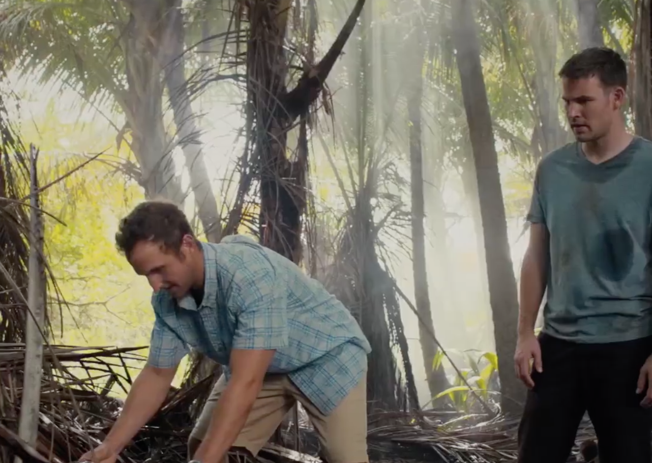
Wrecked is a comedy series about a group of survivors of a plane crash on a remote island. While it seemingly starts off like a parody of LOST, it is definitely not. The one doctor is a pediatrist, AKA a foot doctor. The cop, who could bring authority and control over the unfolding chaos, turns out to be a dimwitted liar who found a gun and a badge. And the one person with military-trained survival skills, that could save them from their demise, dies just as the survivors saw a glimmer of hope—everything is a joke. Unequipped and ill-prepared, and with no sign of rescue, the survivors desperately try to hold themselves together and build a new society, as well as, new identities.
TONE OF VOICE
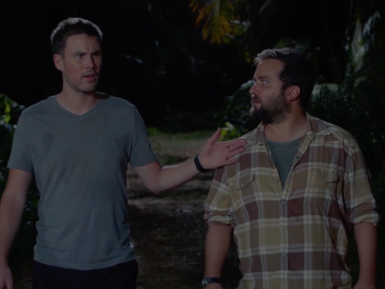
The show had a lot of slapstick humor, with obscene situations and characters. We wanted our TOV to match the griminess of the show, be a little sarcastic and vulgar, and truthful. I often imagined that drunk person at the bar who could turn anything into a joke, knew how to have a good time, and who'd point out things that often go unnoticed or politely unaddressed by any decent/sober/socially-adept human being—a bit of an instigator with dark and dirty, honest sense of humor.
ART DIRECTION
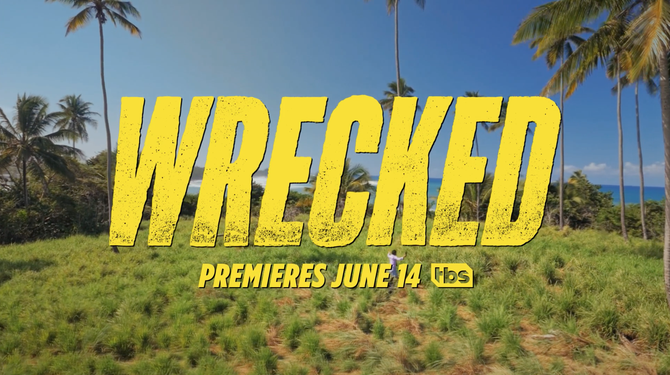
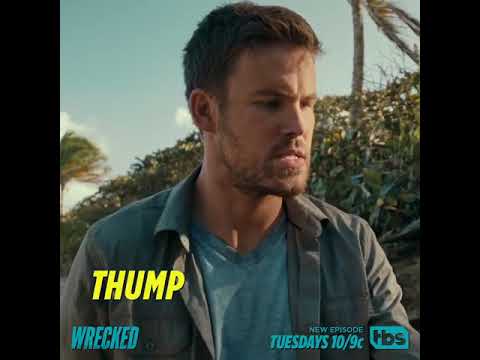
We wanted to create visuals and videos that were equally punchy as the show. We explored bold and bright colors and typography—and we borrowed elements you'd find in action-packed comic books and cartoons.
PRE-PREMIERE
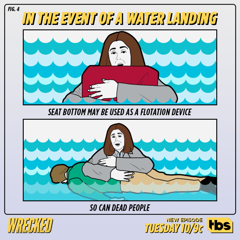
Racing towards the premiere, we created satirical versions of Emergency Briefing Cards and seeded them out. Some were more or less dark and morbid than others—it's that kind of comedy.
PREMIERE
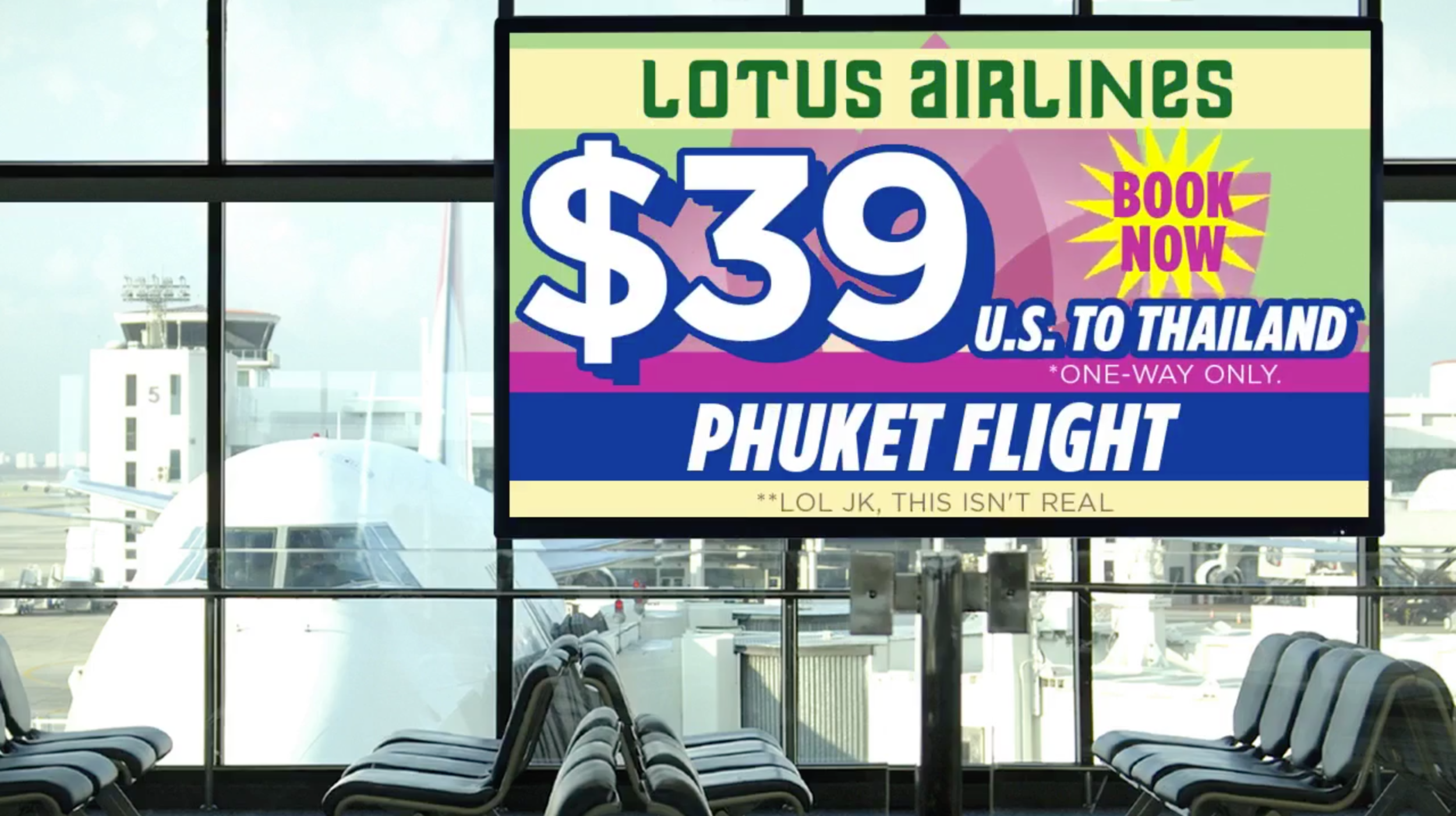
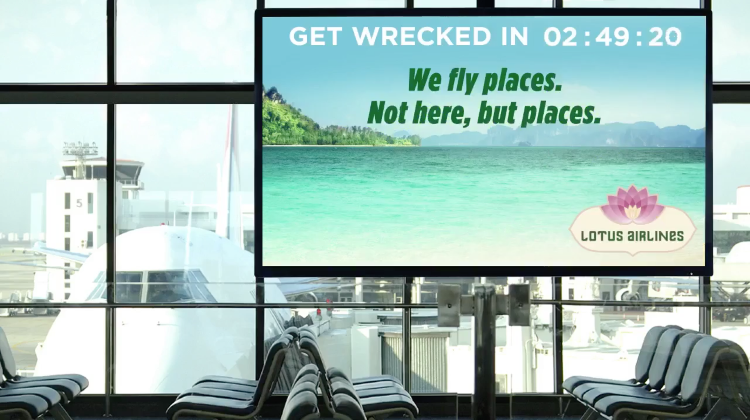
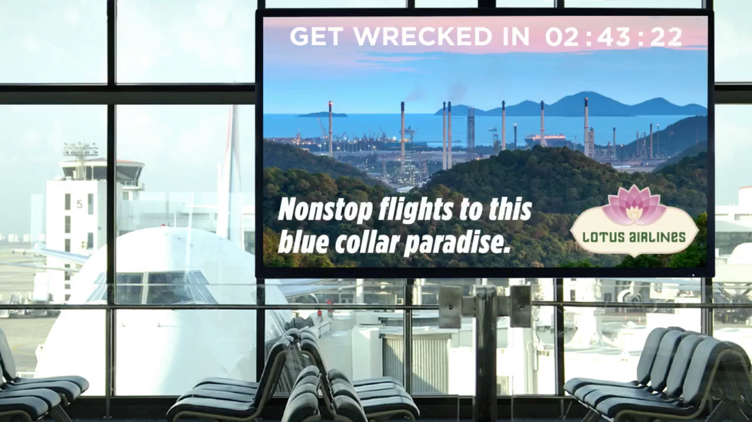
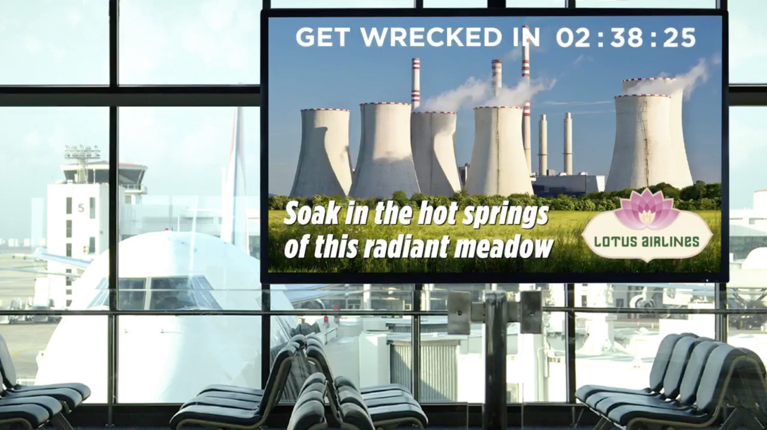
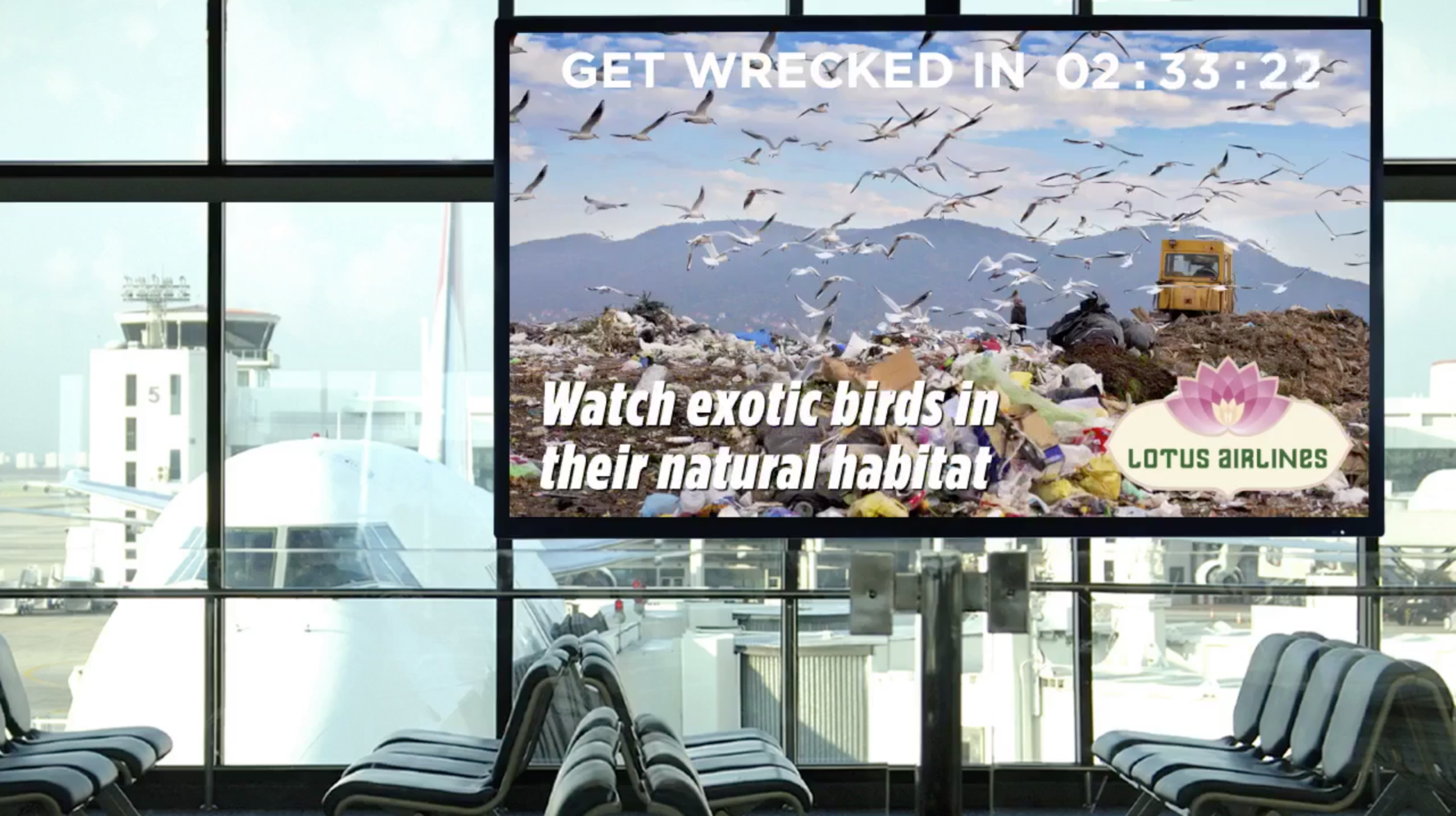
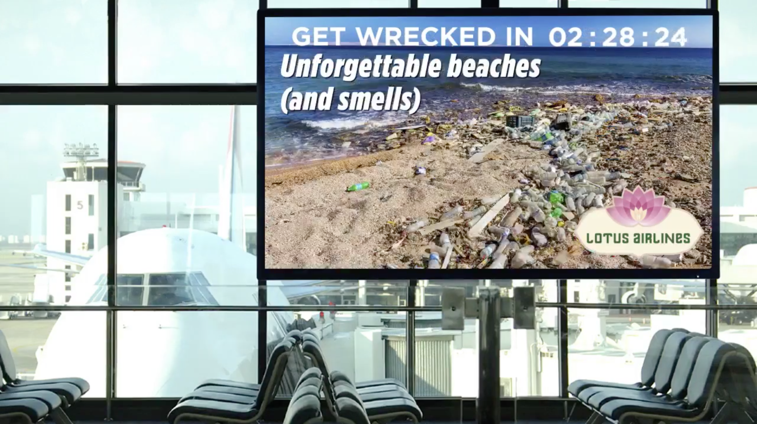
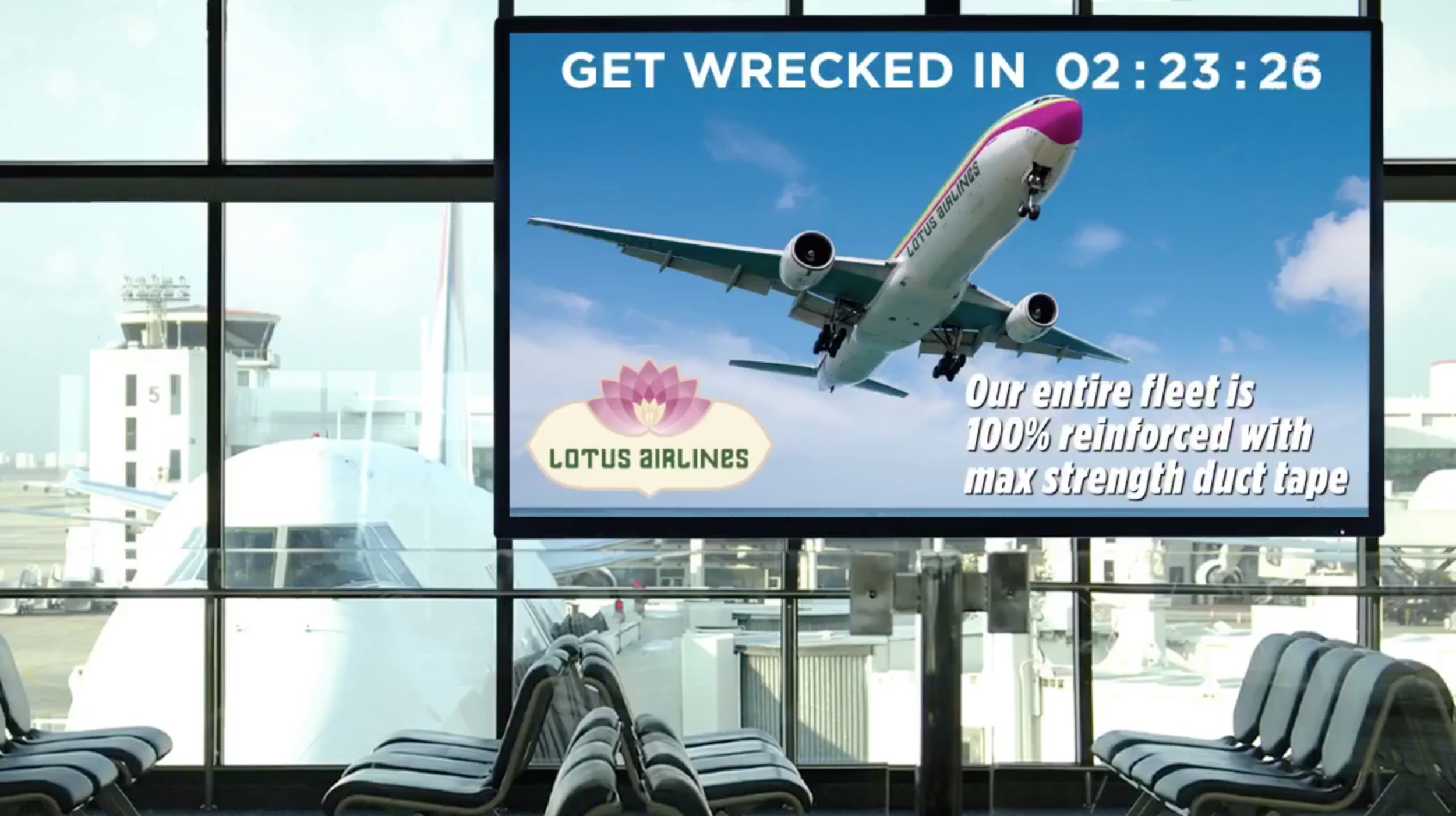
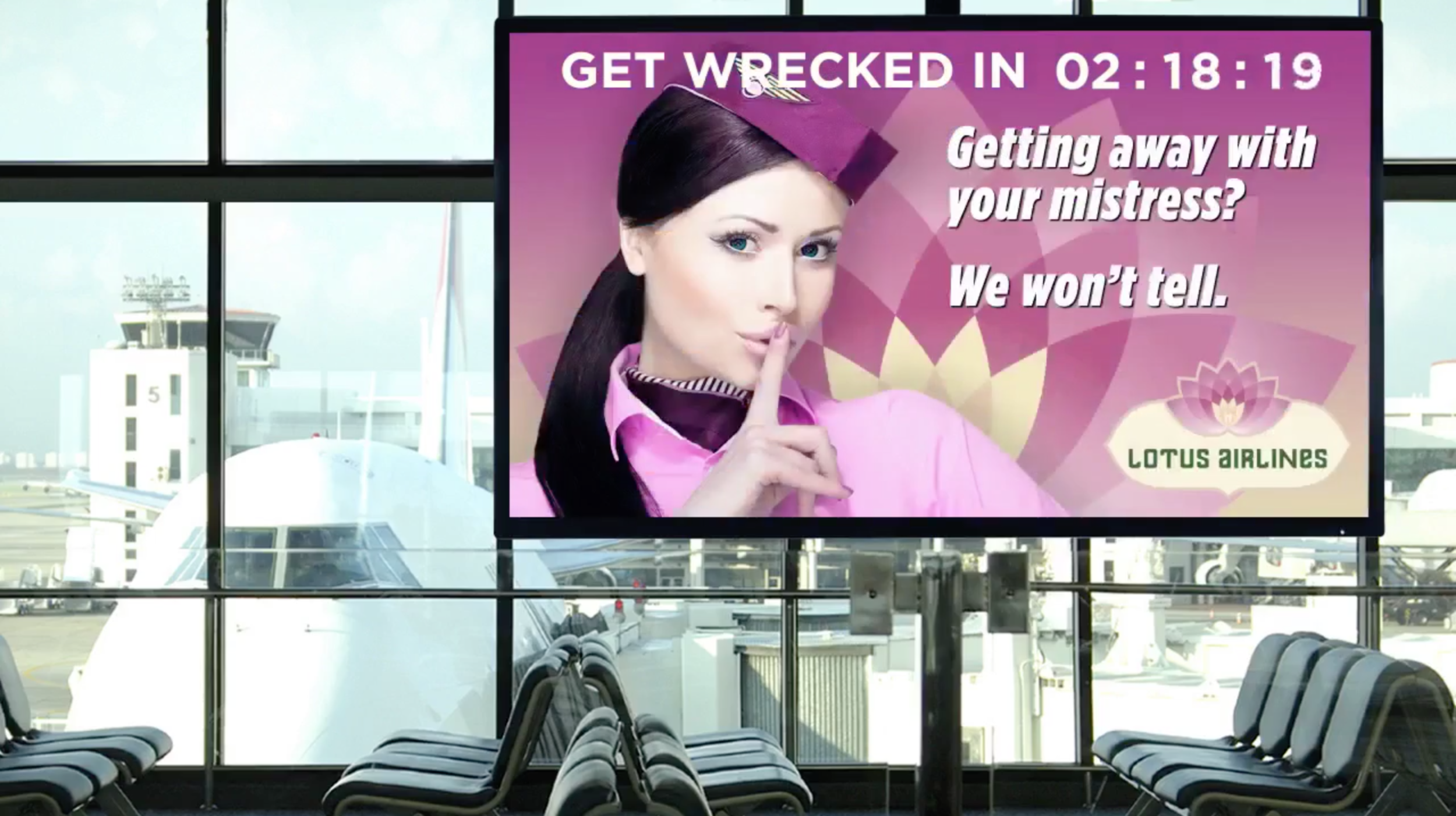
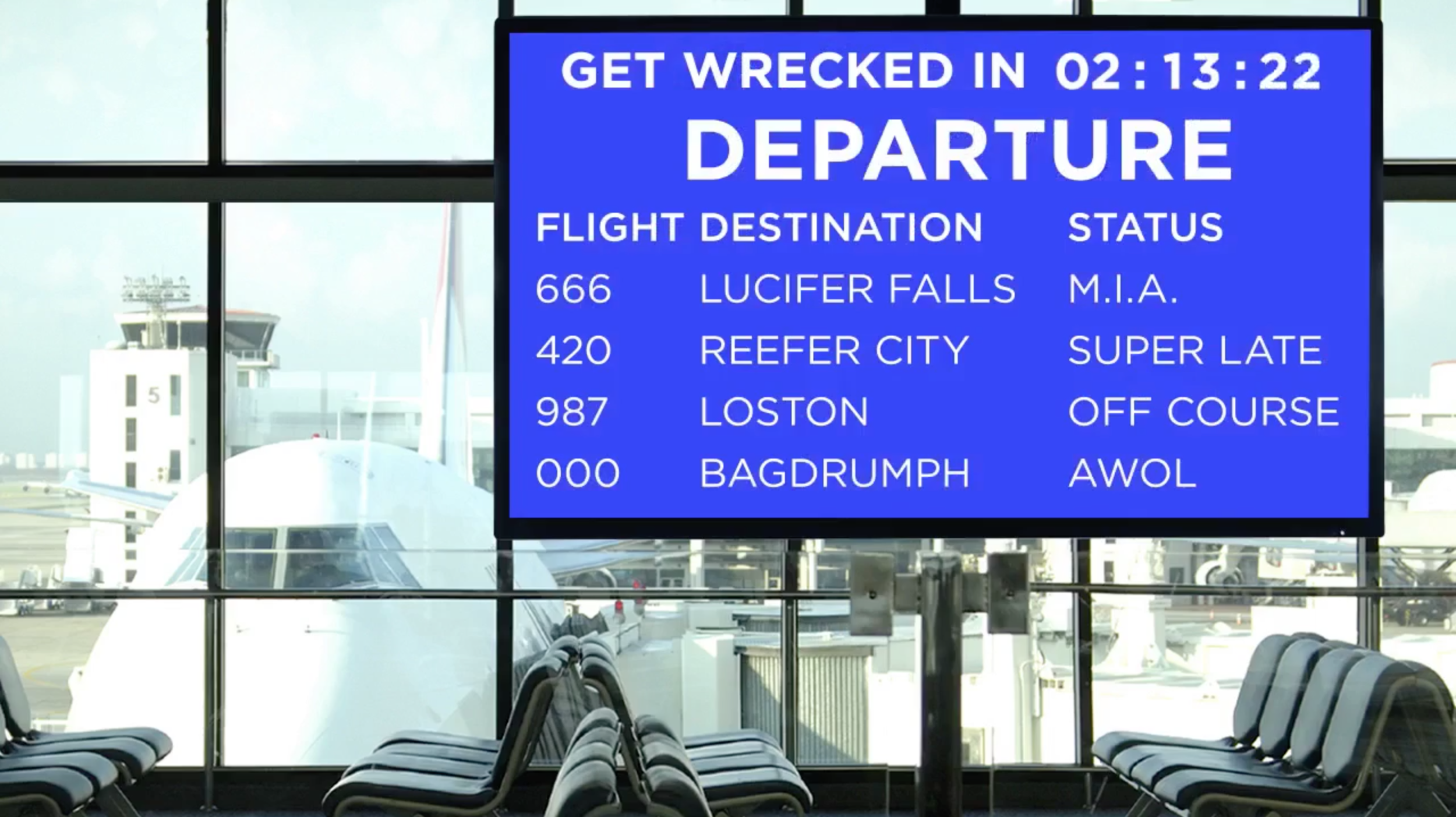
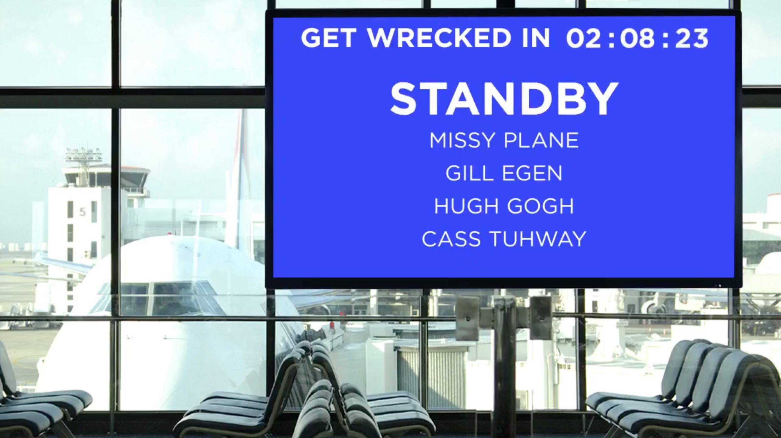
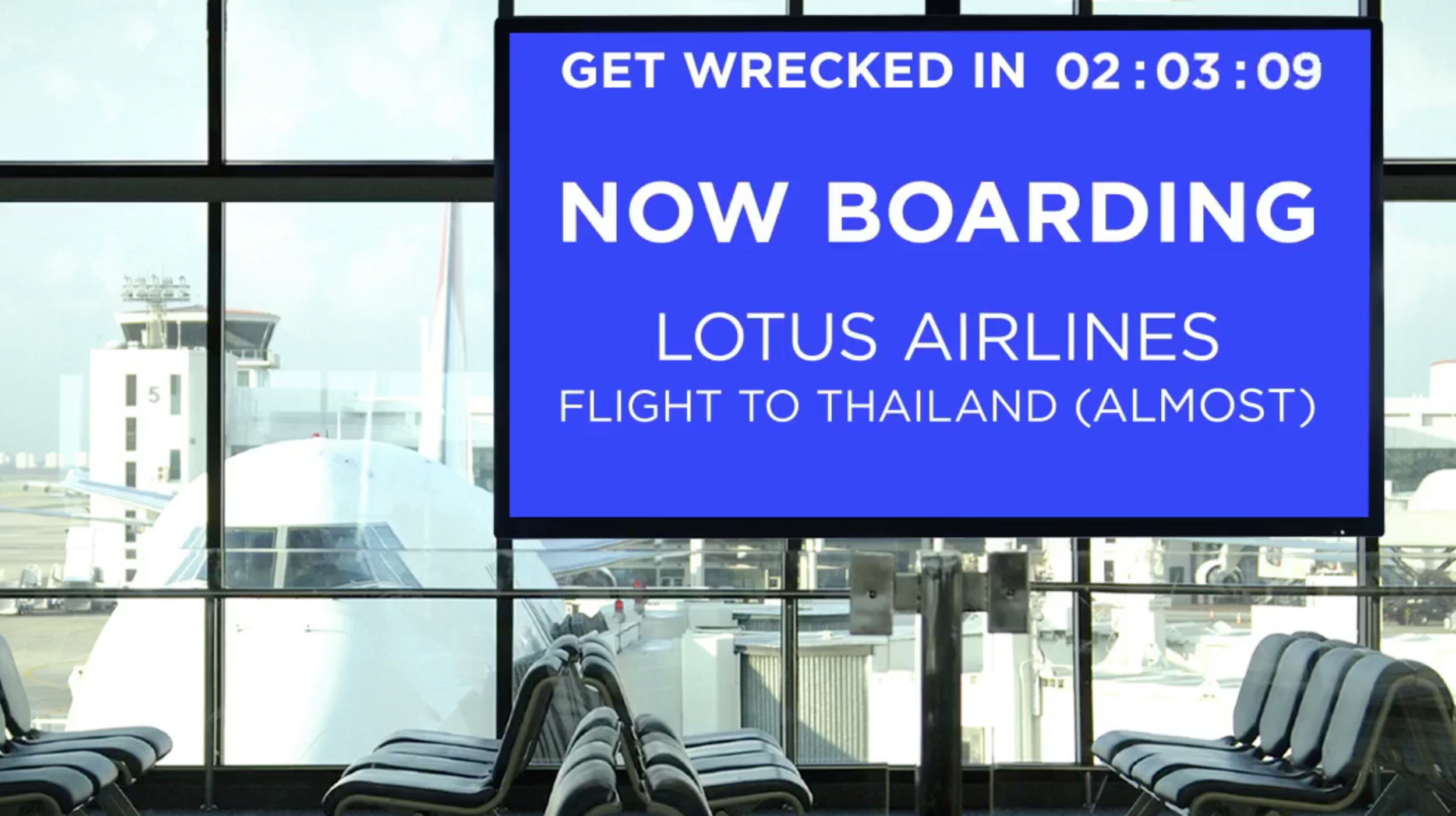
TBS asked us to create a FB Live to show the first episode, and we hacked it so that people would see a pre-recorded video instead of a live-feed. At the time FB Live was relatively new, and our analytics team had a small data suggesting we should have buffer time of 3min. for people to join in (now best practice data says 30min). So before showing the episode, we created a video queue of an airport gate, with audio announcements of boarding/take-off ETA. We also added in a TV by the seating area that had fake ads of the airline from the show packed with jokes.
Watch the video here.
IN-SEASON CONTENT
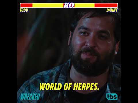
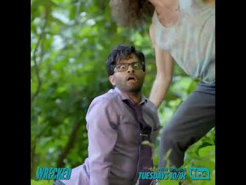
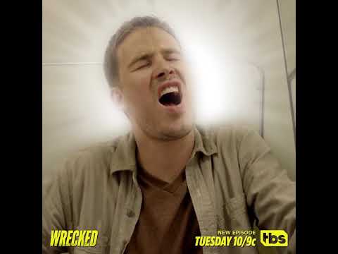
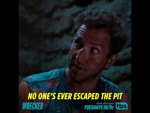
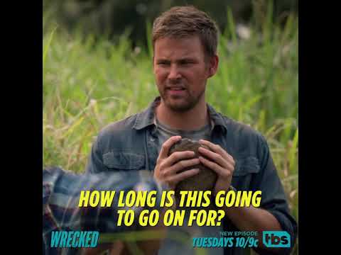
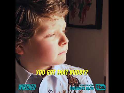
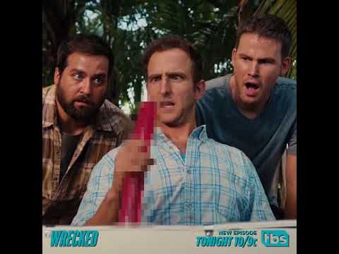
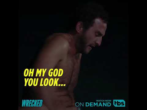
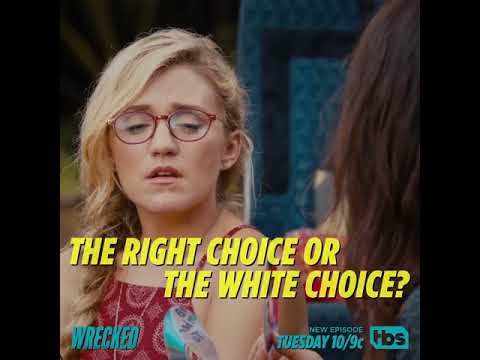
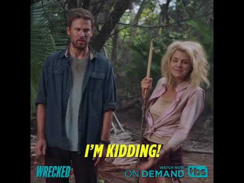
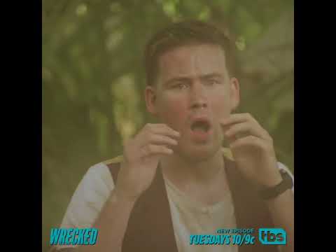
When we were creating content for this show, we spent a lot of time in fine-tuning scenes to tell a joke about a joke. Comedy is all about timing, and what words you choose to say in that given time. The account/strategy teams will often flag our content being too long for best practice on Facebook or Instagram—or that our scenes, original photography and copy were too "gross" to put it on social. Comedy content is one of those things you have to bend the rules a little for. More often than not, without context or setup, the joke belly flops and falls dead. The show itself pushes the envelop and we wanted to carry that spirit. We'd rather have 17-seconds of hilarious content, than having 8-seconds of crap. Not all paid support in the world can make anyone care or not hate crap content. TBS surprisingly loved what we made for them.
SEASON TWO
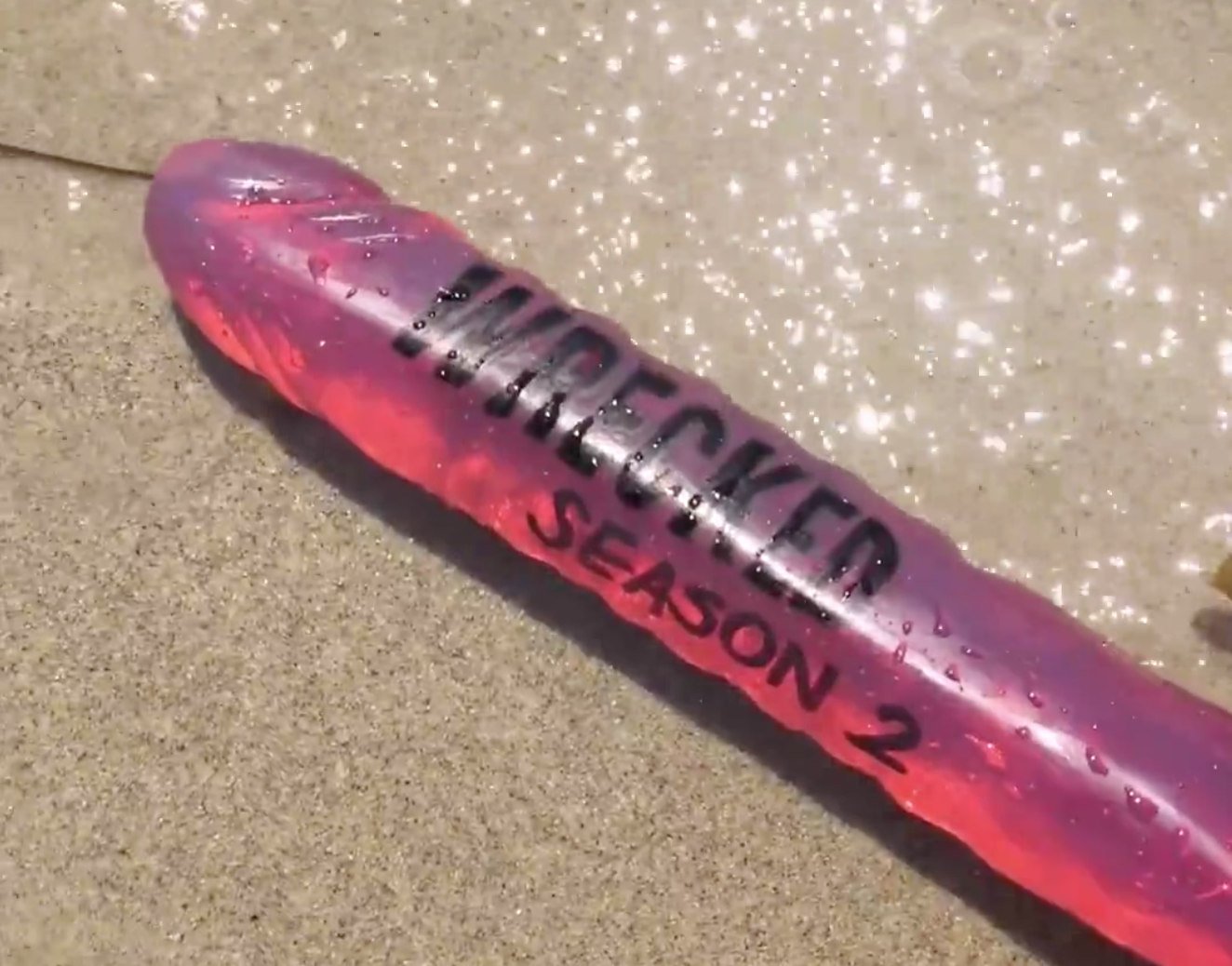
The show received a very positive review both from critics and viewers. As the first season was coming to an end, the network approved for a second. TBS wanted us to create an announcement piece to this exciting news with their audience as soon as possible. We had put together three concepts, and this is surprisingly the one they went with and it was AWESOME. My partner and I thought they'd never go for it but next thing you know, we're shopping for a double-sided pink dildo at a sex shop on a beautiful Monday morning... Then I'm drawing the show's logo on it in my car on the PCH... And then I'm on my knees and elbows, on the beach, with a camera, shooting...THIS. Just so you know, this wasn't just for shock value—if you watch the show, you'd get it.
CREDITS
Agency: Vayner Media
Creative Director: John McGill
Art Director: Terry Lee
Senior Copywriter: Kim Merritt
